All Things Watercolor
What do watercolor beginners want to know? What do beginners need to know?
I think we all wish to spend a little less, create a little more, and see greater improvements in our work.
That’s at the heart of our watercolor wants.
So, what can we do and what do we need to learn in order to make these happen for us?

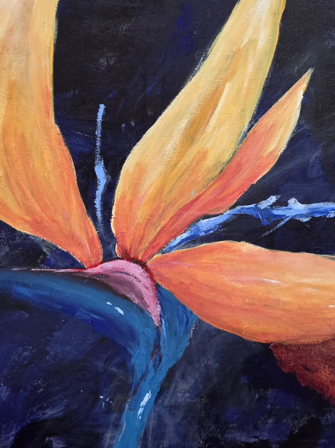
watercolor beginner basics – simple easy loose landscapes
All Things Watercolor
Its about your selection of the Brushes, the Paints, the Papers.
Choosing the right material to accomplish the task as successfully as possible.
Beginners want to know
How To Get Started with Watercolors.
A New Brush, testing….

Watercolor Brushes
Watercolor –
Its a whole different ballgame to oils or acrylics. In those, we are actively trying to ‘cover up’ the support, the canvas surface.
And in oils/acrylics we do, with gusto!

Buttery super Thick, Impasto Acrylics
The trouble comes, switching over to watercolors with that same idea. That, then becomes a problem.
Thicker, heavier wc applications aren’t so great. Neither is covering up the entire paper surface with paints, not leaving any white of the paper visible. This, dulls the painting making it appear tired and over – worked.
Not ‘sparky’ or lively at all!
Watercolor Paint Colors – Absolute Beginners!
- Cobalt blue pb28 2. Permanent Rose pv19 3. Winsor Lemon py175

Watercolor Chart: Just 3 Tubes = Hundreds of Mixes debiriley.art ©
Just for Beginners – 3 Tubes to get you started, its less overwhelming.
Plus, cost is less.
And you get less mud.
And you create a more unified painting.
Win Win!
Watercolor Tips

Colors of the Sea – pigments flow, merging
- Watercolor likes to be diluted, to run free.
- Let its pigment particles sink, flow, flare, merge & To Create!
- Think along the lines of …. “WATER -color.”
- Make the emphasis on the Water.
- Allow the Water to be the vehicle, that carries the Color, as it runs, sinks, melts.
Papers for Watercolor
For well over 25 years, I’ve been a strong advocate (bordering on compulsive?) of Arches Rough 100% cotton watercolor paper for The Beginners especially. I’ve written a few posts on Arches paper for beginners.
I still firmly believe the paper itself, is exceptional.
BUT, in Australia, the importation costs of Arches paper has now, in my opinion…. escalated Beyond any justification I can possibly come up with.
(USA Jerrys online art shop) Arches 300 gsm paper pack of 10 $54.50
making each sheet $5.40 – Which is reasonable.
However, in Australia ONE Sheet of Arches 300 gsm is $17.50 +
A sheet 22×30 of 640 gsm Arches is $38.70
Therefore, I’ve changed my recommendations for watercolor paper.
Saunders is a very good paper – and is now my Watercolor Paper Recommendation.

Impressionist Landscape – Saunders Watercolor Paper
It is absolutely 100% cotton rag and that is the foremost important consideration.
The Cold Press or the Rough surfaces will work well for beginners. It will allow for enough lifting and rinsing off mistakes to resolve most faux paux.
Fabriano 100% cotton rag Rough is sheer delight for the intermediates, the Soft Press and Hot Press great for intermediates as well.
The Cold Press will be fine for beginners.
Winsor and Newton is a great paper, if you can get your hands on it.
But the Cold Press is a dream, and wonderful for beginners too.

Winsor & Newton cold press paper – the watermark
The book that is my favorite reference guide is Watercolor Paper Handbook… Werner Mertz
Well worth the trouble of ordering.
Twice, as it happened in my case.

Watercolor Handbook Werner Mertz
My thoughts
- Be kind to yourself.
- Start off nice and slow; and easy.
- Build your skills and techniques, over time.
- Set yourself goals. Goals…. are good.
- 1,2, 3, 6, 9 month goals. 1 year 2 years 3 years
- Look at this progress… that you have made. Not Sue, not Bob!
- Find some good spots, in each art work you do. Every time. Its important.
References
Classes. Museums. Books/magazines.
Generally, my first recommendation for Beginners is to take watercolor art classes.
Look for an encouraging, instructor with a like minded philosophy.
Research who is in your area. Make the calls and emails. Check them out in advance.
You’ll want to paint from physically tangible, touchable items.
You learn more and faster this way.
Art museums with the Masters would be a second suggestion.
Books and magazines. …. many ‘beginners how to’ don’t meet criteria for accuracy or being adequate.
Using online sources to copy ie “Pinterest” art – This is a minefield, for a plethora of reasons.
Reference sources need to: teach basics and creative Self expression
If they teach replication, that isn’t truly helping us to fully engage and ‘learn.’
How then, will the student learn how to design/simplify/create a painting all on their own, if they’re not shown the basics of how these processes are thought out and done?
If the references show a painting with poor tonal values, poor edges, poor center of interest, poor aerial perspective and pass it off as “ok” – How will the Beginning student learn the correct art basics?
The Australian Artist magazine, The Pastel artist magazine, The International Artist magazine, The Southwest artist magazine typically show high calibre professional work.
They combine the art basics with these critical factors…. Self expression, Creativity, Imagination, Interpretation.
They’re Great places to look and study art techniques. Not copying.
(Online art Piracy, is rampant. Its not ok.
Painters are the same as writers. A painting is the same as a book. We… spent our money and our time, creating a product for purchase.) And yes. Its happened to me.
Tony Smibert …. any of his art books are simply fabulous.
Edward Seago, we all can learn from him in watercolor and in oils.
Finally – The Featured Landscape
watercolor loose landscape
My featured watercolor painting, while not perfect, does show some lovely watercolor attributes.
The flow and merging of paint pigments has been allowed to happen, without coercion.
The edges around the borders are so soft and blurred. It creates a calm and leads the eye inwards.
Only 2-3 paints were used. Some warm golden tones in front to infer its nearness. The colder colors receding, into the distance. Provides a sense of depth, even to this semi abstract landscape.
And lastly, the amount of white space was deliberate.
The viewer is now free to interpret the sky and foreground areas as they wish.
Its up to them.
This open ended invitation to the viewers, I think makes art so much more accessible. More Embraceable. Well, for me, it does.