Its Cool, watercolors
Cool colors dominate in this “super fast” watercolor still life.
Time’s running out so I had to be quick. I needed to try to finish and schedule a couple of posts for when I’m …. otherwise detained for the next couple weeks!!

its cool, watercolors
A useful Technique is to decide ahead of time what the dominance of the painting will be. Either mainly Cool. Or Warm.
50-50% isn’t a crash hot plan. Try for say a 75-25% or so for a better balance.
Watercolor techniques
I used basic watercolor washes for most of this. A couple areas of charging technique, glazing technique and finished with the judicious use of splatter technique. I kept it fast. Easy. Simple.
Cool
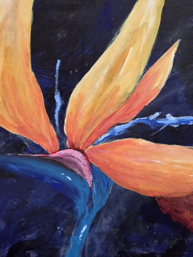
Cool colors I used were prussian blue and quinacridone violet.
I only used 2 colors. It keeps it Fast! Simple and Easy! and No mud.
Cool colors as a general rule, make things recede into the distance and are refreshing, cooling. Distant. Create depth and space.
Greys, lavenders, blues.
Warm
Warm colors generally will advance objects and shapes. Creating the illusion of coming forward into the foreground.
Reds, oranges, terracottas, yellows, yellow greens.
Aerial Perspective
You can create the illusion of depth and perspective simply by placing specific colors in sequence. Warms in front of cooler colors.
ie from the background to the foreground might go like this…….. soft pale grey, light blue/lavender, cerulean blue, ultramarine blue, teal green, light grassy green, yellow green, olive green, rusty warm terracotta, flickers of light red.
Finally –
This design of blue vase and 3 flowers, was totally invented. Spur of the moment.
YOU too, can ‘invent’ things!
YOU too can keep it simple & FAST
be judicious and move on!
life’s too short to get bogged down with the warts.
ignore the warts….. who, really cares if there’s a pin sized smudge…. really!
Cheers, Debi