Light and Shade: The Lily
A mauve water lily gleams against the background’s deep velvet shadows. The dark shadow’s power conveys a drama that midtone could not. The fair lily set in midtone would surely be washed out, a blasé wallflower.

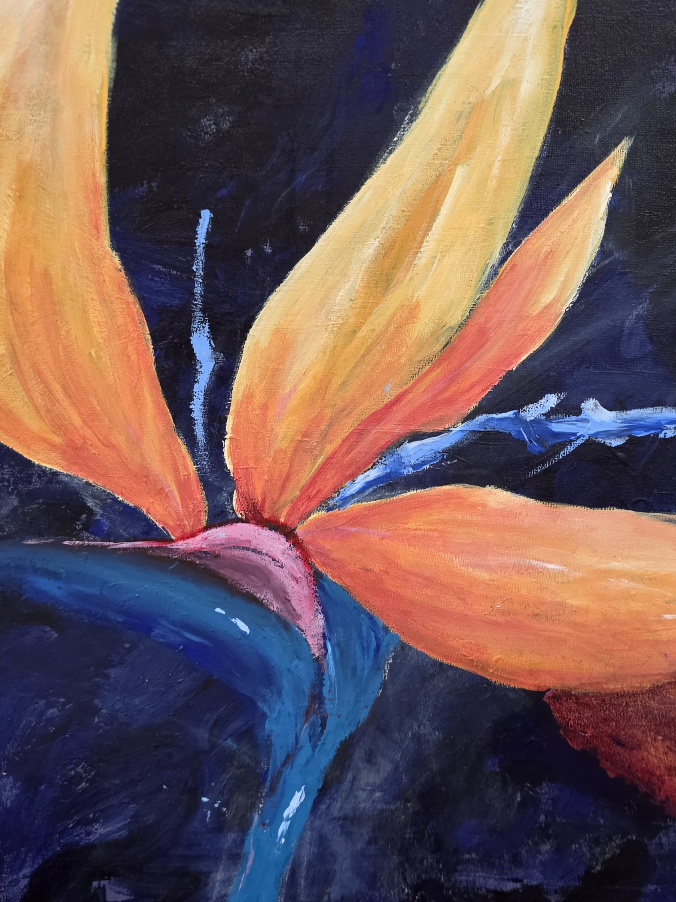
Lily in Light
Tonal Values, Light and Shade
We need the shadows and the darkness just as much as we need the lights, in order to create a balanced harmonious whole.
This is something I have to constantly be vigilant with. I love colour.
As I paint, or photograph for that matter, it is my first impulse to go for the colour…. And ignore the tonal balance of light, mid, darks.
It is a struggle! I still ‘think’ colour first all the time. But, now I’ve learned to be more aware of this tendency and to try to ‘compensate.’
I’ve trained myself through 100’s of repetitions, to also think, “Where is the Light, the Mid, the Darkest tones?”
While in the state of Washington, U.S. back in 1990’s I had the good fortune to have a summer to be mentored by Simon Kogan.
He was instrumental in very clearly, pointing out the necessity of tonal nuances, how to see them and portray them more effectively. Simon is a versatile artist, talented sculptor, painter, printing, etc. I was fortunate to have had a few brief weeks to learn lasting fundamentals through his concise teaching methods.
Handy Hints, for tonal value Ratios
If the image is nearly all mid tone (or for that matter dark, or light) it will be flat, boring, monotonous. A ratio of 50% mid tone – 50% dark won’t be effective either for a 3D look.
I’ve found that roughly, give or take, I like a Ratio of 40% Light 50% Mid 10% Dark Sometimes, for certain images I need to raise ratio of Light or Dark tones for a higher or lower key.
But I always want to try to avoid a monotonous dominance of one tone, whether that tone is Mid tone, Dark or Light.
Whether you’re painting or taking photos – Don’t be afraid of the darks, just be mindful and use them judiciously and in balance.