Lovely Backgrounds
I have a real thing for great backgrounds. The backgrounds, make the painting or the photograph!

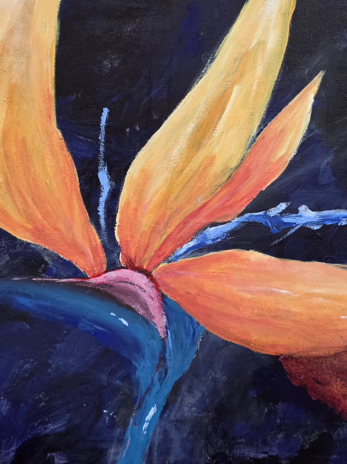
Blossoming Background, photograph, debiriley.art
I will often look straight at the background, poring over them more so than the focal point. A good background will gently lead the way to the focal point while taking the viewer on a lovely afternoon stroll along the way. (To my way of thinking!)
Both of my photos would lose almost of all of their appeal and impact – if, the background was any different.
With just a bit of planning you can make your backgrounds a fabulous part of your art images that frames your focal point beautifully!
Whether in painting or in photography creating a great background is really key. You want one that isn’t too boring nor too busy, but pulls and draws the eye to the focal area.
A flat, dull tired background will lose the viewer’s interest. And a chaotic background will often be too disturbing, sending the viewer …away from your art image.

Vertical – Background and Buds with softly diffused blossoms
Imagine these two images set in a solid, flat dull grey or solid blue background. Or even foliage greenery. Neither would look anywhere near as lovely as they do with the current type of background.
- The current backgrounds create added depth, with the overlapping of shapes and the exquisite soft blurred edges.
- The tonal variations getting paler into the background distance is another feature in these photos, one that you want to remember…. when you go to paint.
- Colour becomes duller, less saturated into the background.
- A horizontal format with its ‘inherent’ laid back, serene feeling can adjust to the slighter ‘louder’ background that is seen in the top photograph.
- A vertical format with its ‘inherent’ more energetic vibe, can easily withstand the greyer more neutral look of the background in the shown photograph.
I hope that helps and gives you ideas for your next background, whether its a photo or a painting!